The State of Things Pandemic – Week 47 2023
A summary regarding the various types of alarming excess mortality, for week 47 of 2023, our 195th week of the SARS-CoV-2 Pandemic.
As of Week 47 of 2023, 3.75 years into the Covid-19 Pandemic and its aftermath, 1,526,543 excess deaths have been recorded to date. Now certainly, the SARS-CoV-2 virus was a deadly pathogen, itself 6.6 times more deadly than the typical annual mortality total for all influenza viruses combined. However, as the reader will infer from the material below, it was the panic-fueled, and in some cases malicious, actions of those few in power which have served to precipitate the larger part of total excess mortality during the pandemic, as well as post-pandemic, periods.
As of November 25th 2023, there have been
628,800 Excess Non-Covid Natural Cause Deaths,
170,110 Excess Non-Natural Deaths, and
372,838 Excess Deaths from Denial of Treatment,1
354,795 Excess Deaths from the SARS-CoV-2 virus (6.6 x annual influenza-pneumonia)2
making for a grand total of 1,171,748 Manmade Excess Deaths of US Citizens, out of a Pandemic Total Excess Mortality of 1,526,543.
A wide diversity of ‘Omicron’ variants were discovered to have been percolating throughout global populations in 2021 (we contend that the genetics indicate, since 2017), featuring a Case Fatality Rate which turned out to be curiously on par with the well-established annual influenza mortality benchmark (a metric of human frailty as opposed to necessarily just pathogen virility – see Chart 1 below).
Thus, it became increasingly clear throughout our analysis that most of the globe (having already been exposed to lower-mortality proto-Covid variants) fared Covid-19 relatively well because of the advance immunity imparted in the years prior to the official pandemic. Moreover, that disruption, lockdowns, iatrogenics, denial of treatment, along with our quod fieri final solution, have collectively served to kill the majority (namely 1,171,748, or 76.8%) of the US Citizens who died during the 195 weeks of the pandemic thus far. It is clear, despite the original danger presented by the Wuhan through Delta variants of the SARS-Cov-2 virus, that this circumstance quickly escalated into a man-made tragedy within the United States and other Western nations.
USA Nominal Excess All Cause Mortality – 4.9%
The beige line in the chart below shows the actual CDC Wonder deaths per week for the two years prior, as well as years-of and years-post the pandemic. The dark orange baseline is normalized from the years 2014-2019, representing a 1.4% annual growth in mortality for the US in terms of all causes. This 6-year baseline reflects a balance between a retrospective lengthy enough to provide statistical significance, but not so long as to be confounded by generational effects or immigration impacts.

Balance Sheet – USA Excess All Cause Mortality – 7.4%
When examining excess mortality metrics and considering them in the context of the broader summary of excess mortality, the resulting balance sheet (shown in Chart 2 below) is derived. A crucial distinction between systems analytics and mere ‘statistics’ resides in the requirement for systems dynamics to comprehensively depict an entire schema of interdependent relationships, in terms of both end-to-end agreement and coherence. Such systems engineering expertise and rigor characterizes both my academic foundation as well as my five-decade-long professional career. Such exemplifies as well the distinction between a hack or journeyman technician, versus a real scientist.
When individuals express disagreement with the parameters or approaches I utilize in my models, it’s important to note that they enjoy the luxury of not having to substantiate their one-off contentions through the accountability of a coherent system in its entirety. This is exemplified in part by the ‘Balance Sheet’ in Chart 2 and the Deviation from Trend (DFT) inflections depicted in Charts 10 through 12 below – which all feed into a single coherent system involving thousands of hours in its development.
I tend to be cynical regarding most disagreements from amateurs or even medical professionals, because these unqualified objections tend to be unaccountable, conducted in isolation, and serve to introduce incoherence into the overall model. Yet their proponent is conveniently and lazily unaware of this. Credibility is earned by engaging in the meticulous and intensive work entailed in describing a system, not in running stand-alone stats, deceptive linear regression graphs, or academic poseur heuristics. Such tools will not make up for shortfalls in acumen, integrity, experience, or effort – and the ruse is easily detected by an experienced systems professional.
For instance, making the baseless or linear-extrapolated and lagged claim ‘There is no increase in cancer mortality’, in a vacuum, and not even knowing what an ‘MCoD’ or ‘Spring Lull’ is, constitutes an act of appeal-to-ignorance deception. So much more than pablum is required from these claimants – and no matter how much they scream and insist, they are still wrong (see Excess Cancer Mortality in Charts 5 and 6 below). In the realm of systems analysis, adherence to such a professional standard is paramount, and I make no apologies for upholding it.
That being said, let’s now examine the various metrics of excess mortality as of week 47 of 2023.
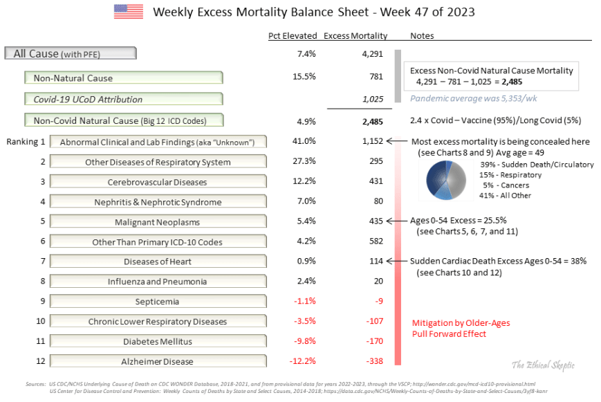
The reader should note that the CDC eliminated reporting of the Big 12 ICD categorizations (their Morbidity and Mortality Weekly Report) at the end of October 2023. This data set was useful in helping spot anomalies (‘pull forward effect’ for instance) in the rates of death in the US. Just as in the case of their refusal to release vaccine cohort data or spurious VAERS record disappearances, data sets effective in targeting the harm introduced by the Covid-19 mRNA vaccine are all being systematically screened from public access. We put together a scrape which assembles the same data from Wonder, as one used to be able to obtain from the CDC Weekly MMWR Report, so that we are able to continue this tracking (that is, until they eliminate Wonder altogether and simply appeal to tyrannical authority in its absence).
The following charts all feed systemically into and reconcile inside the summary balance sheet above.
USA Excess Non-Covid Natural Cause Mortality – 4.9%
The beige line in the chart below shows the CDC Wonder Excess Non-Covid Natural Cause deaths per week for the two years prior, as well as years of and years post the pandemic. The dark orange baseline is normalized from the years 2014-2019, representing a 1.12% annual growth in mortality for the US in terms of all non-Covid natural causes. Just as in the case of all this specie of charts, the 6-year baseline reflects a balance between a retrospective substantial enough to provide statistical significance, but not so long as to be confounded by generational effects or immigration impacts.

Perhaps the only good news to be found within Chart 3 above is the flattening in this Excess Mortality trend over the last year. This may well simply be an impact of the pull forward effect (because of our conservative choices with regard to its metrics), so we will watch how this excess trends over the outyears in order to discern what is indeed occurring.
USA Excess Non-Natural Mortality – 15.5%
The beige line in the chart below shows the CDC Wonder Excess Non-Natural Cause deaths per week for the two years prior, as well as years-of and years-post the pandemic. The dotted baseline is normalized from the years 2014-2019, and comprises a 1.42% annual growth in mortality for the US in terms non-natural causes. This reflects excess mortality from unsound lockdown and open border practices, in terms of suicide, addiction, assault, accidents, abandonment, and despair (SAAAAD). Disruption (loss of access to medical services or medications) deaths are now included inside iatrogenic and denial of treatment tallies (medical mistakes).

It is our hope that the downward trend in this metric since mid-2021 continues until this mortality recovers its baseline.
USA Excess Cancer Mortality – 5.4% with Novel 1.9% CAGR
The green-to-red line in Chart 5 below shows the CDC Wonder Excess Attributions of underlying cause of death Cancer to multiple cause of death Cancer, per week for the two years prior, as well as years-of and years-post the pandemic. The dotted baseline is normalized from the years 2018-2019, and indexed to the last 7 week average as compared to those same 7 weeks of 2018/19, so it is not a ‘regression’. Since this is a relative index, it should exhibit no trend or growth rate (outside the context of Covid mortality peak periods of course). The current excess of 295 deaths reflects cancer deaths which are concealed from the underlying cause of death ICD code, and must be added back into the mix in order to make Excess Cancer Mortality comparable to its past baseline. We reconcile this into Chart 6 below, applying it only after the pandemic period ended.
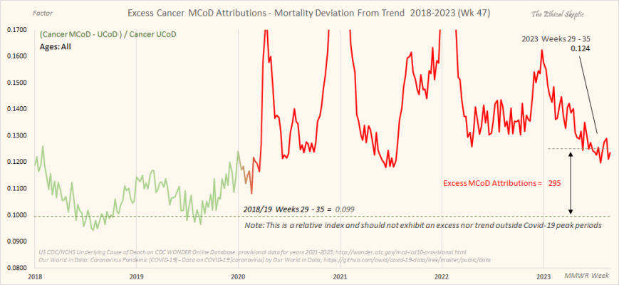
When done correctly and ethically, cancer shows a clear inflection in growth rate at Week 14 of 2021 – the week of fastest uptake in the mRNA vaccine within the US population. In fact, every single chart we have run which depicts an excess mortality currently underway (not all of them do this), indicate this same inflection point of Week 14 of 2021.
This is unequivocal – the vaccine is causing excess death, and likely 95% of all of our Excess Non-Covid Natural Cause Mortality, 628,800 deaths, shown in Chart 3 above.
Moreover, cancer is a hard ship to turn; but once turned, will not come back to normal for perhaps decades. I contend that the outyear numbers will show that we have made, very possibly, a horrible mistake. Time will tell, but will also only whisper to those who bother to watch. I guarantee you that the smarter-than-thou among us, will not watch at all. Take this as a hint as to their agency and integrity. Nothing they proffer is honest – everything a rhetorical deflection and nothing more.

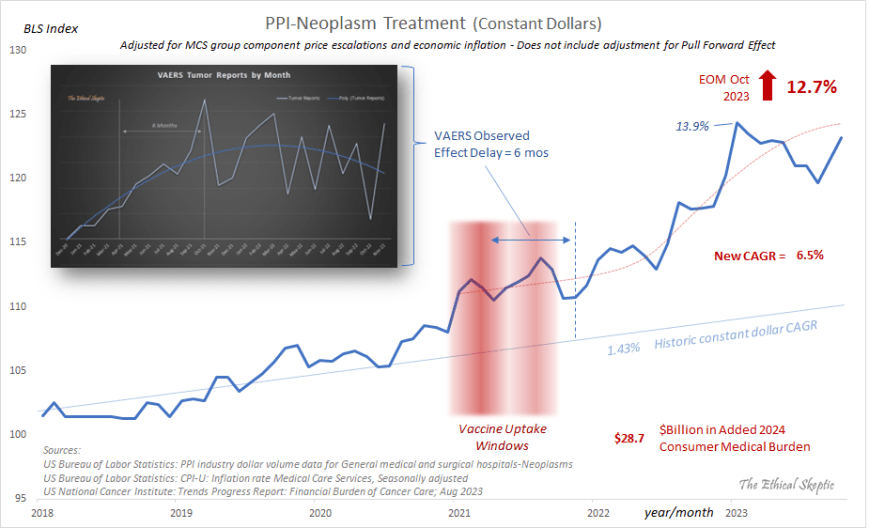
In corroboration of this alarming set of indices with regard to Cancer, is the constant dollar rise in expenditures for cancer treatment within the United States as of end-of-month October 2023. The rise in Producer Price Index-Neoplasm Treatment highlighted in Chart 7 below is adjusted for both inflation as well as its Medical Care Service (MCS) group price escalations. The actual raw figures show an even more aggressive increase than the 12.7% indicated on the right hand side of the chart.
USA Abnormal Clinical and Lab Findings Excess Mortality – 41%
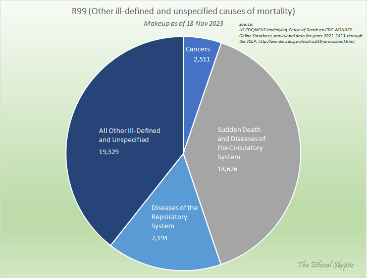
The beige line in the chart below shows the CDC Wonder Abnormal Clinical and Lab Findings deaths per week for the four years prior, as well as latest year of the pandemic. The dotted baseline is normalized from the years 2014-2022, and ends with a pronounced (normal condition) hockey stick formation in the last 33 weeks of the timeframe depicted. The excess above this dotted line reflects excess mortality of uncertain cause (ICD code R99 in particular). As depicted in Chart 8 below, to date this comprises 46,500 concealed deaths.

These deaths are broken out by type, in Chart 9 below. They comprise heavily, sudden, cardiac and circulatory deaths, as well as diseases of the respiratory system and cancers. The average age of this mortality cohort is 49 years old. These are not old people dying of Covid-19 nor Long Covid, they are dying from the mRNA vaccine – as it is clear that this excess began with the rollout of the vaccine in December 2020, as shown in Chart 8 above.
Before we broach the topic of our Deviation from Trend charts, it is helpful to remember that each of these charts feeds into the Chart 2 ‘Balance Sheet’ above – some charts show increases and inflections, other charts show nothing and/or decreases. Regardless, they do not constitute stand-alone conjecture. If one adjusts the parameters of these charts, then they lose agreement with the overall Balance Sheet depicted in Chart 2 above – and suddenly we have Covid or its mRNA vaccine fictitiously curing a whole host of diseases. One cannot tweak the analytics by means of stand-alone, trivial, or rhetorical critique – because they miss this type of inconsistency.
Every disagreement one brings to the table must be accountable to fit coherently inside the entire model – or it is merely an attempt to deflect, deceive, or push an uninformed opinion, and nothing more.
USA Sudden Cardiac Death Excess Mortality Ages 0-54 – 37.9%
The blue line in the Deviation from Trend (DFT) chart below (Chart 10) shows the CDC Wonder Sudden Cardiac Death Mortality per week for the two years prior, as well as four years of the pandemic, for the age 0 to 54 bracket. The dotted baseline is normalized from the years 2014-2019, eroded by pull forward effect (PFE). As do many of the charts of this type (not in unaffected ICD sub-groups however), an inflection occurs at Week 14 of 2021. This is the impact of the mRNA vaccine. Note that we have redacted the final 26 weeks of this chart because that timeframe contains RXX ICD codes which artificially escalate in the final weeks (see Chart 8). So for conservancy’s sake we exclude these weeks from the analysis.
One should note that the mortality measured within this chart is not mortality related to aging-related heart disease. That grouping of ICD code mortality is actually down significantly (-28.3%). Do not let anyone equivocate between aging-related heart disease and sudden cardiac deaths in younger persons. In the latter we have a pronounced problem, which can be concealed by blending it with the PFE-impacted former. We caught the CDC using this trick in November 2023.
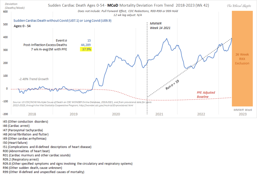
It is important to note that the Sudden Cardiac Death Mortality arrival curve depicted in Chart 10 above was confirmed, as to inflection, excess, and trend, by the Society of Actuaries in their Covid-19 Mortality Survey Report of November 2023. The full report can be accessed by clicking here.
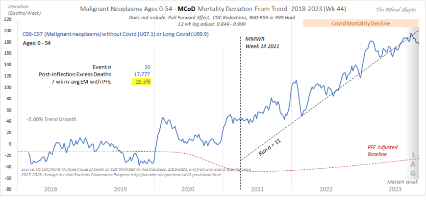
USA Cancer Excess Mortality Ages 0-54 – 25.5%
The blue line in the Deviation from Trend (DFT) chart below (Chart 11) shows the CDC Wonder Excess Cancer Mortality per week for the two years prior, as well as four years of the pandemic, for the age 0 to 54 bracket. The dotted baseline is normalized from the years 2014-2019, eroded by pull forward effect (PFE). As in many of the charts of this type (not in unaffected ICD sub-groups however), an inflection occurs at Week 14 of 2021. This is the impact of the mRNA vaccine. The soft increase which occurs in 2020 is dry tinder. These are individuals who died a couple weeks or months early, and as such, this data does not constitute actual trend data – unlike the data from 2022 and onward, which exhibits a strong and unqualified trend in this cancer mortality metric.
USA All Non-Covid Natural Causes Excess Mortality Ages 0-24 – 41.7%
The blue line in the Deviation from Trend (DFT) chart below (Chart 12) shows the CDC Wonder All Non-Covid Excess Natural Cause Mortality per week for the two years prior, as well as four years of the pandemic, for the age 0 to 24 bracket. The dotted baseline is normalized from the years 2018-2019, mildly eroded by pull forward effect (PFE – does not impact younger ages as hard). As in many of the charts of this type, an inflection clearly occurs at Week 14 of 2021. Just as in Chart 11 above, this too is the impact of the mRNA vaccine.
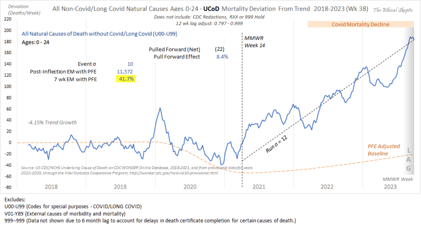
Thus it is clear that we have a problem, and that problem is the Covid-19 mRNA vaccine. This serves to broach the question, just how deadly has the vaccine, along with all our other panic-fueled mistakes, indeed been? We answer that question in Chart 13 below.
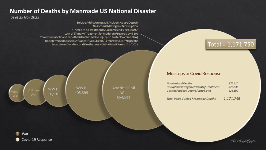
USA Full Covid-19 Mortality Accountability – 1,171,750 Manmade US Deaths
The chart below shows the total impact of our poor decision making as a society, in terms of total mortality, and compares that mortality to the various wars and conflicts our nation has suffered. Of key note inside this death tally are the 628,800 deaths inside the Vaccine/Sudden/Long Covid tally. 95% of this metric resulted from the impact of the mRNA vaccine itself, with the remaining 5% attributable to primarily Long Covid.
Such is the state of things pandemic, week 47 of 2023, our 195th week of the SARS-CoV-2 Pandemic.
Turbo cancers may be easier ships to turn with the following combination therapy:
They want you dead.
Do NOT comply.


ARE these numbers actually low? Asking.
There is no way that Covid was 6 times more deadly than the flu, which normally kills between 50 and 200k per year...Indeed, Omicron appears to have been impressively harmless...When they said that the hospitals were overflowing here in AZ, we know first hand that they were not, quite the contrary..So where did that come from?