Houston, We Have a Problem (Part 1 of 3)
A very important article on DEATHVAX™ induced adverse events.
Seven of the major eleven International Classification of Diseases codes tracked by the US National Center for Health Statistics exhibit stark increase trends beginning in the first week of April 2021 – featuring exceptional growth more robust than during even the Covid-19 pandemic time frame. This date of inception is no coincidence, in that it also happens to coincide with a key inflection point regarding a specific body-system intervention in most of the US population. These seven pronounced increases in mortality alarmingly persist even now.
The following work is the result of thousands of hours of dynamic data tracking and research on the part of its author. The reader should anticipate herein, a journey which will take them through the methods and metrics which serve to identify this problem, along with a deductive assessment of the candidate causal mechanisms behind it. Alternatives as to cause which include one mechanism in particular, that is embargoed from being allowed as an explanation, nor even mere mention in some forums.
At the end of this process, we will be left with one inescapable conclusion. One which threatens the very fabric and future of health policy in the US for decades to come.
Storm Warnings
On March 21st 2021, a longtime mentor, friend, and business partner of mine, an otherwise healthy 68 year old male, unexpectedly suffered an autoimmune cascade which ended up shutting down his pancreas, liver, kidneys, and finally heart. He had just received his second dose of the Pfizer vaccine on that Thursday prior. Carl quickly descended into a coma, and then died on March 26th.1
On May 29th 2021, a rather odd signal began to develop in my regular Covid-19 tracking models. The change which alerted me resided inside the magnitude of the ‘Symptoms, signs and abnormal clinical and laboratory findings, not elsewhere classified (R00-R99)’ ICD death code group (see chart in Exhibit D and also by clicking here). About this time and as a result of this observation, I began to track R00-R99 deaths, along with eleven other ICD-10 death codes, non-natural cause deaths (suicide, overdose, assault, etc.), and finally a statistic called ‘Excess Non-Covid Natural Cause Deaths’. As the reader reviews the calculated trends featured inside each of these death categorizations, they should note that this was indeed both a prescient and sound decision.
On December 1st of 2021, attending a business meeting at client’s medical complex, passing through the facility I took notice that their large oncology department waiting room was slammed full with patients. This queue of persons awaiting their oncology appointments spilled out into the hallway and finally on into the building atrium.2 While tempted at first blush to pass this off as a result of patients and their physicians ‘catching up on deferred screenings’ and/or ‘Covid-limited office days/hours effect’, my prior observational lessons suggested that I hold-off on such a knee-jerk inference, at least until the CDC – National Center for Health Statistics data (three bullet point sources below) proved out over the coming months. This as well, proved to be a wise decision.
It is not simply the probative and reliable nature of the data one has sourced, but moreover the relative dynamic in how that data changes over a significant or critical period of time, which allows the astute investigator to draw key inference.
The reader should note that there are few fancy academic heuristic tricks employed inside the models presented in this article. Rather, I’ve elected to employ good old-fashioned persistence, curiosity, hard work, logical deduction, and an experienced nose for strategy, systems, and problem-solving. Within my models, I seek to derive this inference through comparing the dynamic (not static statistics) patterns of change across a large set of differentially-compared data points and critical interval in elapsed time, in order to drive this article’s process of deduction. This is what I do professionally inside markets and for corporations and nations after all. I identify, and develop strategy to address exceptional challenges. My motivation in writing this article however is simple. I do not seek income, subscribers, power, office, notoriety, a political victory, book sales, nor a new career. I am simply compelled to stand in the gap for those who have no voice – they who lay victim to the present political hubris and its long shadow of darkness.
That being said, let us outline briefly the data sources employed in these models. All the data used within the analyses presented within this tripartite article series are derived primarily from the following three resources and links. Herein, they are collectively referred to as the MMWR (CDC Morbidity and Mortality Weekly Report) data, because these databases are updated as a part of that CDC weekly reporting process.
US Center for Disease Control and Prevention: Weekly Counts of Deaths by State and Select Causes, 2014-20193
US Center for Disease Control and Prevention: Weekly Provisional Counts of Deaths by State and Select Causes, 2020-20224 (please note that the term ‘provisional’ with regard to this file only impacts the first four to six weeks of this data for the most part. The taper curve can be seen here for the August 17th 2022 drop. Don’t let anyone tell you that 2021 and 2022 data is unreliable because it is provisional – if we have an emergency we must rely upon this data)
US Center for Disease Control and Prevention: Wonder: Provisional Mortality Statistics, 2018 through Last Month – Query by Constraint Engine5
As a part of the process of tracking this MMWR reporting data, by October 2020 it became clear that Excess Non-Covid Natural Cause Mortality (see Exhibit E) was slightly elevated versus its historical trend, yet still conformed to annual seasonal death arrival patterns. A November 2020 chart depicting this can be observed by clicking here. Remember this rather nominal arrival form of non-Covid natural cause deaths for later on – as it is the Holmesian ‘dog that did not bark’.
Despite the fact that many maladies are not seasonal, the reality is that humans indeed are seasonal beings. We tend to die more commonly in the (northern hemisphere) winter months of December and January of each year. Such mortality trends tend to form familiar patterns across the years. These patterns and trends are therefore useful as a comparative in spotting anomalous conditions, such as pandemics. It was reasonable to assume in October of 2020 however, that this slight elevation in non-Covid mortality was indeed an outcome of the systemic damage which the SARS-CoV-2 infection and virus spike protein can produce in the human body. An erstwhile Covid delayed death if you will.
However, by MMWR Week 3 of 2022, a disruptive-exception pattern began to manifest inside this non-Covid mortality group, one which contrasted highly with the 2020 pandemic period alone (not to mention the 2014 through 2019 timeframe), and finally one which could no longer be denied (see an example chart by clicking here). Within these early charts it became clear to me that the complexion of US mortality, the who, when, and why – had changed substantially from early 2021 to the end of 2021 and on into early 2022. In fact, an inflection-point could even be estimated, establishing when this change had occurred (April 3rd – 10th, MMWR Week 14 of 2021) – a crucial date with regard to this novel mortality arrival pattern. Yes, of course people were dying of Covid-19 and as a nation we needed to continue diligent action addressing its challenge.
Nonetheless, by the end of 2021 it had become abundantly clear that US citizens were not just dying of Covid-19 to the excess, they were also now dying of something else, and at a rate which eventually became higher than that of Covid itself.
Identifying The Problem (Methodology Employed and Results Observed)
In a past article, we outlined for the reader those characteristic elements which render a problem facing a nation or corporation, as exceptional. These are the problems I call ACAN problems, or challenges which feature characteristics of Asymmetry – Complexity – Ambiguity – Novelty. As the reader will note below, the challenge with regard to Excess Non-Covid Natural Cause Mortality bears all the requisite features of an ACAN problem. Asymmetry in terms of which cancers are suddenly rising, which age groups are dying to greater numbers, or disparities between cohort vaccination rates and observed infections. Complexity in terms of the Yule-Simpson vulnerable distribution of excess deaths into their various ICD-10 codes. Ambiguity in terms of the political motivations behind official health data tracking practices and Nelsonian gaps in information. And finally, novelty in that we are facing a challenge for which our epidemiological community did not prepare, and with which mankind has never truly grappled before.
In many ways the challenge before us now, may well be as daunting as Covid-19 and the pandemic response itself. This of course all depends upon how the trends depicted inside this article pan out. In my experience, accelerated growth never continues forever, and there are always mitigating circumstances and unintended consequences which serve to confound the future. The reader should keep this in mind as they view the charts and inferences herein. We should always hold out hope in the face of a storm. This was of course as sound of an advice at the beginning of the pandemic as it is now.
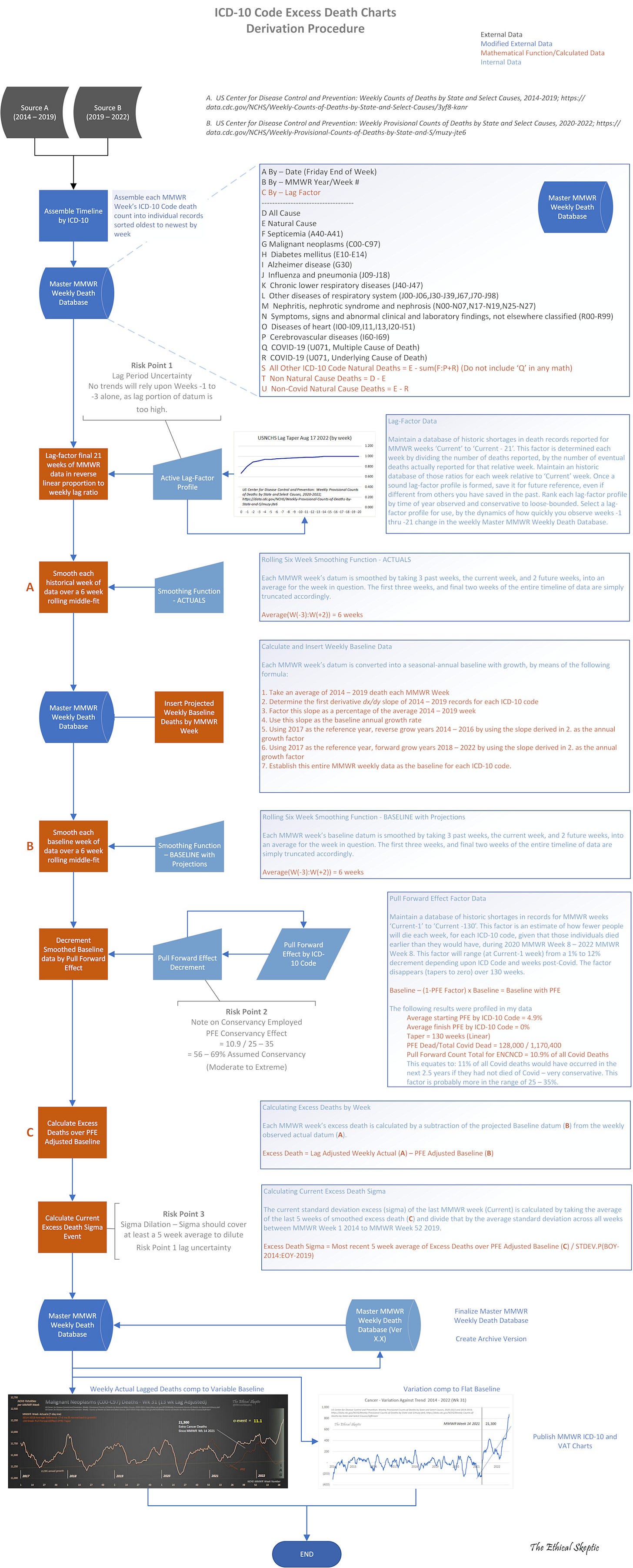
For a detailed data and derivation flow chart, outlining data source, handling, and modification, to the first derivative baseline, its smoothing, series of calculations, and how the entailed risk-points are compensated for – in other words, how the charts in this article are assembled – please click on the flow chart thumbnail icon to the right.
Regardless, data is derived from sources 1 and 2 above, and the basic formula for the derivation of Non-Covid Natural Cause Mortality is straightforward, just as it sounds.
ENCNCM = All Cause Mortality – Non Natural Cause Deaths – COVID-19 (U071, UCoD) – Baseline Death Reference (BOY 2014 – EOY 2019)
The Problem

The series of charts in Exhibit A to the right constitute a set of quick charts (called ‘Variation Against Trend’ or VAT charts) I maintain in my databases, and monitor each week (along with other factors such as reporting lag, Pull Forward Effect, etc.). I began to notice a potential problem beginning to coalesce with regard to many of these depicted trend lines, in late 2021 and into early in 2022. However, before anything statistically significant could be reported, the data needed sufficient time for the tail of statistical deaths from the deadly Delta variant to clear from the weekly MMWR reporting data (the three sources listed earlier). This process was delayed as well by the CDC’s ‘system upgrade’ which began June 3rd 2022 and still has not been fully completed (see pertinent CDC announcement).
As of the publishing of this article, 9,290 death records posted in the June 2nd MMWR update showed as redacted four weeks later and still remain missing from the data. Another 13,245 deaths were re-categorized by the CDC from primarily cancer and heart death, to other codes such as Alzheimer, kidney, or respiratory deaths, as can be seen in part inside this chart. It is hard to envision a scenario explaining this 52,000-record data tampering across the most at-risk weeks (MMWR Weeks 4 through 20) of 2022, as not constituting malicious obfuscation of US citizen mortality data. As a former intelligence officer and strategist for nations facing some pretty tough corruption challenges, I am a skeptic of power, and no eager subscriber to Hanlon’s Razor.
Keep in mind that the charts in this article do not even reflect addition of the CDC-shorted death records redacted for MMWR Weeks 4 through 20 of 2022.
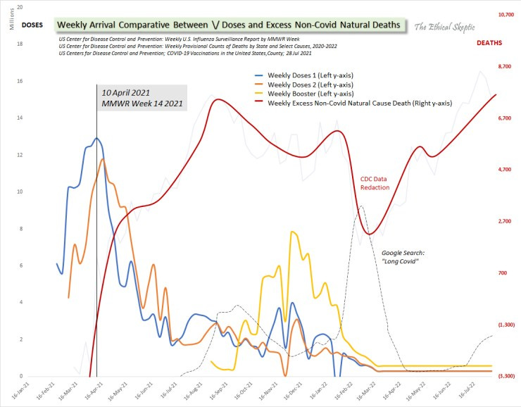
Despite this death record data shortfall, seven of the ICD-10 VAT charts depicted to the right (click on the image to obtain a separate tab version, and click again to magnify the image) depict trends which should instill enormous concern in the mind of any professional, in terms of US citizen mortality post MMWR Week 14 of 2021. In order to comprehend why this week is of critical importance, please click on Chart 1: Critical Inflection Date in Vaccine Doses and examine Exhibit B: Arrival Comparative Between Doses and Deaths (below) – both of which will be detail outlined in Part 2 of this article series. The alignment of critical dates inside these charts is not only pivotal in our argument, but is prohibitively compelling as well.
The charts of particular concern, I have highlighted with a yellow background and listed below. These include the charts featuring stark post MMWR Week 14 2021 rises in mortality. Specifically, they are
Excess non-Covid natural cause, 5+ sigma
Cancer and lymphomas, 9+ sigma
Other respiratory conditions, 2 sigma
Nephritis/Nephrotic syndrome, 4 sigma
Septicemia, 2 sigma
Heart diseases and ailments, 2 sigma
All other ICD-10 tracked natural cause deaths, 4 sigma
With regard to these select ICD-10 codes, I have endeavored to highlight only those which have exhibited a stark difference between their arrival patterns during the 2020 pandemic period, and that period after MMWR Week 14 2021. While there are indeed increases in deaths incumbent inside the other ICD-10 codes, those increases appeared to plausibly conform to their same arrival patterns for 2020 as well. In other words, they appeared to be heavily Covid-related in their dynamics, both before and after the Week 14 2021 inflection.
Of particular concern, are those deaths which relate to body-wide regulatory systems as opposed to specific organs or causes. In other words, cancer and lymphomas, heart, autonomous myocarditis/pericarditis/conductive disorders, injuries to the liver and kidneys, etc. These are not only the canaries in the coal mine in terms of pathology, but may serve to indicate as well that a pervasive systemic disruption is at play inside the average US citizen human physiology, especially over the last 71 weeks. These are the death groups which exhibit the most stark trend of increase post MMWR Week 14 2021. I sincerely wish to be wrong in this, and would be the happiest person on Earth if I found a critical flaw in the underlying data or methodology which served to refute it all. Unfortunately, after months of challenging my own work from every angle I could conceive, and patiently waiting for the CDC/NCHS to fix their MMWR reporting systems and processes, I sadly fear that I am not wrong. Hence the need for this article.
As challenging as the excess mortality and VAT charts are, before we examine three particular sets of excess mortality, let us for a moment also review the compelling rationale behind the MMWR Week 14 2021 inflection date. This date is a critical matter of concern for no small reason. Its derivation is no coincidence. The ‘Doses and Deaths Comparison Chart’, Exhibit B below, outlines why.
The Inflection Risk in Three Charts
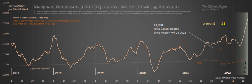
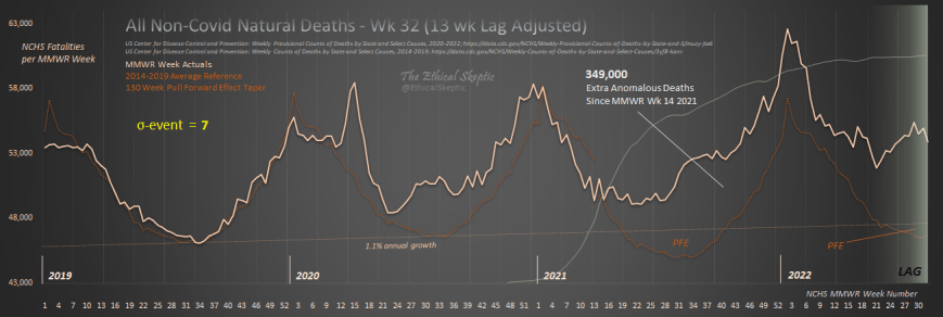
Three charts in particular compel the greatest concern in terms of their being indicative of population-wide systemic health disruption. They are Excess Malignant neoplasm and lymphoma deaths (C00-C97 – Exhibit C), Symptoms, signs and abnormal clinical and laboratory findings, not elsewhere classified deaths (R00-R99 – Exhibit D), and finally yet most importantly, Excess Non-Covid Natural Cause Deaths (Exhibit E). Those three charts’ ICD-10 trends against historic baseline, are depicted below. Please note that we are evaluating the trend in the peak level of the R00-R99 data in Exhibit C, and not the fact that this ICD code acts as a disposition-depleting bucket (hence the normal stark rise in later weeks to the right hand side of the chart). I will leave these three charts here, for your examination and consideration, before venturing into Part 2 of of this article series – wherein we conjecture regarding the potential cause(s) of this undeniable problem in terms of US citizen health and mortality.
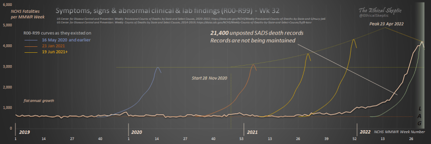
This defacto concealment of 21,400 death records (inside the R00-R99 code group), is independent of the 22,535 records which were removed from the June 2nd 2022 death data and have either yet to be placed back into the database or were reassigned to non-threatening ICD codes.
That makes for a total of 43,935 potential myocarditis, cancer, pericarditis, conductive, nephrosis, liver, and/or lymphoma deaths which still have not even yet posted into the data over which this article is sounding the alarm.
That is 7% of the total deaths for the period in question, and possibly 15 to 25% of these highly concerning death ICD-10 groups’ trend data – missing. Even absent this data however, the entailed trends are alarming.
Finally, we end with the most important chart of all – the chart which indicates deaths which are not from accidents, suicide, addiction, assault, abuse, despair, disruption, nor Covid-19. The Excess Non-Covid Natural Cause Mortality chart which we began monitoring on May 29th 2021. What I called then, the ‘What the hell is this?’ chart. As one can see, we have lost 349,000 younger Americans to something besides Covid and non-natural death, during the period from 3 April 2021 to 13 August 2022. The current rate of mortality in this ICD categorization, is around 5,000 – 8,000 per week (the database shows a most recent five-week, weekly average of 7,887 deaths – subject to lag of course) – which exceeds most weeks of the Covid pandemic itself (save for the absolute peak periods).
By now, if all these mortality excesses were indeed a holdover from Covid-19 itself, they should have already begun to tail off. Unfortunately they are not only not tailing off, in many cases they are still increasing.
Accordingly, and without a shadow of a doubt, we have established that right now there exists a problem in terms of US citizen health and mortality. One which is differentiated from Covid-19 itself, and began in earnest MMWR Week 14 of 2021. Our next task, and what will be outlaid in Parts 2 and 3 of this article series, is to employ these and other observed arrival distributions to winnow out the causal mechanism(s) behind this concerning trend in US mortality.
Having made significant progress on the second and third article already, we very much look forward to publishing for the reader, our next article in the series, ‘Houston, We Know the Mechanisms (Part 2 of 3)’.
Twitter: @ethicalskeptic
Twitter: @ethicalskeptic;
US Center for Disease Control and Prevention: Weekly Counts of Deaths by State and Select Causes, 2014-2019; https://data.cdc.gov/NCHS/Weekly-Counts-of-Deaths-by-State-and-Select-Causes/3yf8-kanr
US Center for Disease Control and Prevention: Weekly Provisional Counts of Deaths by State and Select Causes, 2020-2022; https://data.cdc.gov/NCHS/Weekly-Provisional-Counts-of-Deaths-by-State-and-S/muzy-jte6
US Center for Disease Control and Prevention: Wonder: Provisional Mortality Statistics, 2018 through Last Month; https://wonder.cdc.gov/controller/datarequest/D176;jsessionid=5E04864E989106BB6376CAC90A74
Please note that the Pull Forward Effect (PFE) is initiated at a single point in time (Week 14 2021), in order to make it clear what is happening in the calculations. This does not affect the eventual number of excess deaths, nor the argument being made. One can observe the Pull Forward Effect manifesting in the beige line immediately preceding this date – and observe as well that the PFE assumed inside our model is far less than its reality at that time. The PFE tapers to zero across the succeeding 130 weeks after its date of inception – so as time winds on, it becomes less and less of the overall excess death calculation. Its principle is contained in the following thought experiment. If you take 100 people of all ages, and in one year, kill off the 20 oldest persons in that group, the intrinsic rate of death for that group will be lower for the next decade, versus the previous one, because the available population of those who are more likely to die, has been depleted for the short term. This risk in conjecture is cited and evaluated for conservancy in the flowchart earlier in the first section of this article. As well, please note that PFE is almost negligible as a contribution to the argument by the middle of 2022.
Please note that the Pull Forward Effect (PFE) is initiated at a single point in time (Week 14 2021), in order to make it clear what is happening in the calculations. This does not affect the eventual number of excess deaths, nor the argument being made. One can observe the Pull Forward Effect manifesting in the beige line immediately preceding this date – and observe as well that the PFE assumed inside our model is far less than its reality at that time. The PFE tapers to zero across the succeeding 130 weeks after its date of inception – so as time winds on, it becomes less and less of the overall excess death calculation. Its principle is contained in the following thought experiment. If you take 100 people of all ages, and in one year, kill off the 20 oldest persons in that group, the intrinsic rate of death for that group will be lower for the next decade, versus the previous one, because the available population of those who are more likely to die, has been depleted for the short term. This risk in conjecture is cited and evaluated for conservancy in the flowchart earlier in the first section of this article. As well, please note that PFE is almost negligible as a contribution to the argument by the middle of 2022.
Do NOT comply.



do fauci, zelinski even look at these numbers? do they report these to the president? a disaster, we got some bureacrats in a bubble ....
here some good view of whats inside that bubble .... from kushner ...
https://sagehana.substack.com/p/jared-kushner-the-lancet-had-a-study
What we all suspected and some highly credentialed censored folks anticipated now coming into clear focus with work like yours. Thank you!